Project Overview
The assignment tasked me with developing a web dashboard to assist individuals with diabetes in tracking essential health data such as blood glucose levels and food intake. The overarching goal was to provide users with a clear overview of their health to facilitate effective management of their condition. Throughout the project, my vision was to create a user-friendly platform that empowers individuals to track and manage their diabetes with ease.Working independently, I undertook all aspects of the project, from conducting early research and empathizing with users to ideation, sketching, and beyond. By immersing myself in every step of the UX design process, I ensured that my efforts left both users and stakeholders delighted with the results, underscoring the project's success in meeting their expectations and needs.
My role
User-research
Competitive analysis
Interaction design
UI-design
Goal and problems
Individuals newly diagnosed with type 2 diabetes often face a multitude of challenges, including feelings of overwhelm, uncertainty about dietary and lifestyle changes, and the need to monitor various health metrics. Diabeat aims to address these challenges by providing an informative and supportive website platform.
As I delved into the project I started with just imagining what it could look like and feel like to get diagnosed with diabetes. I could only imagine the overwhelm and uncertainty. There must be a million of questions and now this great uncertainty on how you should manage their condition.
This is were Diabeat comes in. With its informative dashboard it offers guidance and support through user-friendly features such as educational resources, tips for managing diabetes, and an onboarding process that provides clarity on what to expect and how to navigate the platform.
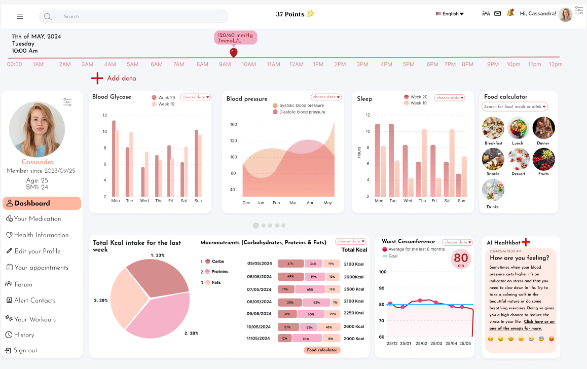
Monitoring Health Metrics: Tracking health metrics such as waist circumference, sleep patterns, blood pressure, blood glucose levels, and macronutrient intake is crucial for managing type 2 diabetes. Diabeat's dashboard allows users to log and track these metrics over time, providing a comprehensive overview of their health status. The app logs all data and interacts with your logs and continually gives you personalized feedback. This way the user can gain control and manage their symptoms and treatments.
Visualizations and personalized goal tracking features help users monitor their progress and stay motivated to make healthy lifestyle changes.
Goal Setting and Progress Tracking: Setting goals and tracking progress is key to managing type 2 diabetes effectively. Diabeat enables users to set personalized health goals and track their progress towards achieving them. For example, users can set goals for waist circumference, blood pressure, and blood glucose levels, and the dashboard provides visual feedback on their progress towards these goals. Additionally, users can receive reminders and notifications to stay on track with their goals and appointments.By addressing these challenges and providing informative and supportive features, Diabeat's website dashboard empowers individuals newly diagnosed with type 2 diabetes to take control of their health and make informed decisions about their care.
Research insights
I did a competitive analysis to see what most of the users use for managing their diabetes, and I found that most people use either MySugr or DiabetesM. They both re great apps and helps the user manage their diabetes really well with its many features like for eg. Bolus calculator, blood sugar reminders and logbooks and so many more useful features.
But as I was thinking and empathizing, just imagining someone who newly got diagnosed with diabetes type 2, or just someone who doesn’t have any idea of all these new things they now need to keep track of, I find that both apps lack knowledge on the disease itself and a guide that explains the lifestyle of people with diabetes and what now will be important. The features are there but there are no place for the new diabetic users to gain more knowledge on his or her condition in these apps.
Their doctor will probably go through this steps and I’m sure most people would Google search out everything they can and need to find BUT, I would have loved to see a gathering of information and a simple quick guide that explains the steps that needs to be taken. As well as what everything is and means for someone who doesn’t know anything about diabetes and it’s treatments. I can empathize with people that get this diagnose and not have a clue how overwhelmed and anxious they must feel, especially at the beginning so having one place where they can turn to to read about the topic and as well connect with others who just got diagnosed would be essential and comforting. Like a community where people could write questions, thoughts or just vent out their emotions. It would also help newly diagnosed people to get their questions answered and comforted to see that they are not alone.
Another thing I liked that the MySugr app has was a game feature, it made it more fun to log data when you got points. MySugr also had a more modern feel to it, that still could get some improvements whilst the DiabetesM app had many great and important features in their basic free plan which was better in a way, but the app wasn’t as “fun”. So these are some things I would definetely think of and include in my design. To combine the most important features like for eg. reminders for checking of glycemic index, blood sugar levels tracker with reminder, Insulin Bolus advisor, personalized logging, overview progress report, estimated HbA1c, PDF/Excel reports, secure data backup, community forums with ability to DM, food database that calculates the amount of sugar, carbs and nutrition. In that way the app does more for you and helps you manage your diabetes really well and helps you get assured that you are taking care of your health in the best way possible.I also think it would be better to allow the apps features to be totally free to everyone and let it cost a one time cost at download, instead of paying monthly. To pay monthly will become very expensive in the end and in my opinion I don’t think that is fair in this kind of situation concerning your health, because no one wants to get diagnosed with diabetes in the first place.
Sketches
At the top-left corner of the sketch, I added the date, followed by icons representing information guides and stories, messages, and a notification bell. Adjacent to these icons is a welcoming text accompanied by a profile icon and a settings icon for customization.Additionally, I incorporated a timeline at the top, allowing users to drag and drop a pointer element to track their blood sugar levels at specific times. The dashboard is fully interactive, accessible with a simple tap anywhere.Below the timeline, I included a plus sign for users to log various types of data. Enhancements to data visualization diagrams ensure users receive comprehensive health information crucial for managing their diabetes effectively.In the top-right corner, a food log calculator aids users in calculating macronutrients, simplifying the process of monitoring sugar intake and promoting better health management. This addition empowers users to gain better control over their health journey.

Applied design principles
1. Prioritize User Experience: During the design process, my focus was on the user, ensuring that the Dashboard provided a minimalistic yet comprehensive overview of essential health data.
Recognizing the potential overwhelm faced by newly diagnosed individuals with Type 2 Diabetes, I incorporated a user guide and onboarding feature to offer clarity and guidance. This proactive approach, integrated into the account creation process and accessible on the Dashboard, aimed to address users' questions and uncertainties. Additionally, I introduced an AI Healthbot to provide interactive feedback as users logged their data, enhancing engagement and support.
2. Emphasize Usability: While aesthetics are important, usability takes precedence. The Dashboard not only boasts a visually appealing design but also prioritizes functionality to retain user engagement. Users benefit from a clear overview of their health data, historical logs, and personalized advice, tailored to their mood. This seamless integration of usability and aesthetics sets the platform apart, offering users a comprehensive solution unmatched by competitors.
3. Ensure Consistency: Through competitive analysis and a thorough understanding of user needs, I ensured consistency in the platform's design and functionality. Drawing insights from existing apps while identifying gaps in addressing diabetic individuals' requirements, I crafted a user experience that exuded familiarity and added value. This approach not only instills confidence in users but also strengthens their connection with the platform, fostering long-term engagement and satisfaction.
4. I used visual hierarchy by letting the settings and notifications be at the top, then followed by a timeline with one of the most important information for a diabetic, their blood glucose level. There they could drag and drop the icon to follow up their values. I then placed a menu bar at the side and all the diagrams in the middle so that they would be the focus etc.
5. To give the user control I have implemented ways to log data, and edit their profile where they can customize their personal information as well as their color theme of the dashboard. They could always navigate back or cancel an action if needed and as well tab their way through all functions on the page.
6. To design for accessibility I needed to think of the colors, to make sure the contrast would be enough, as well as thinking of the color blind. The focused state when tabbing or clicking has to be shown clearly through using the stroke function. It’s so important that everyone can interact with the dashboard regarding of condition with hearing, vision or cognition.
Design decisions
In crafting the design for my dashboard, I opted for a modern and minimalistic aesthetic characterized by soft, peachy, pink, and beige tones. This color palette was chosen to evoke a sense of warmth and personalization, fostering a welcoming and less formal atmosphere. To complement this aesthetic, I selected the Josefin Sans font, known for its clean and elegant appearance.To enhance user customization and personalization, I incorporated a feature allowing users to change the color theme of the dashboard. Options such as grey, blue, or green provide users with flexibility in tailoring the dashboard to their preferences.Given the diverse range of features and functionalities offered on the dashboard, I organized the layout into distinct "island corners," grouping related categories together. This approach facilitates navigation and ensures a cohesive user experience, allowing users to easily locate and access the various components of the dashboard.
To ensure consistency, efficiency, and scalability in the design process, I created this "mini-design system". It serves as a centralized resource containing standardized design elements, patterns, and guidelines that facilitate cohesive and unified product experiences across various platforms and devices.
Accessibilty
In crafting our design, I prioritized accessibility by meticulously checking color contrast to ensure optimal readability and inclusivity. By adhering to accessibility standards, we strive to create a user experience that is accessible to all individuals, regardless of their abilities or impairments.
My commitment to user-centric design principles and attention to detail played a pivotal role in developing a solution that satisfied both user needs and stakeholder expectations. By prioritizing accessibility and seamlessly integrating design elements, the result was a product that received commendable feedback from users and stakeholders alike. This positive response underscores the effectiveness of the design approach in delivering a satisfying user experience.
If you like what you see and want to work together, get in touch!


